Friday, December 19, 2014

PHOTOSHARE 14
Weird photoshop stuff


Who: Tumblr user porrayanross (apparently)
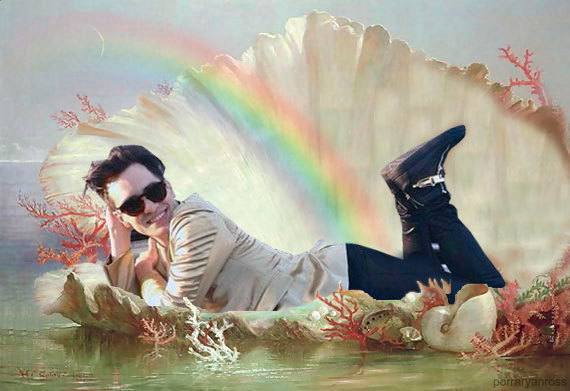
What: Brendon Urie, lying in a giant seashell with a rainbow
Where: An oceanic sort of scene
When: 2014
How: Photoshop
Good, Bad, or Ugly: It's pretty abstract hipster glam art kind of stuff you can find all over the internet, although I find this one to be slightly more artistic than others which are made more for the 'weird' factor. Look at that seashell. It's pretty classy. As in, classic art. Style-y. It's legit as heck. The rainbow is also a nice touch, although the suit and seashell color are a little too similar.

Tuesday, December 16, 2014


Symmetry 
 ISO 200 4.3 mm f/3.1 1/35 sec
ISO 800 4.3 mm f/3.1 1/35 sec

ISO 1600 4.3 mm f/3.1 1/45 sec

ISO 400 4.3 mm f/3.1 1/45 sec

ISO 400 4.3 mm f/3.1 1/45 sec

PHOTOSHARE 13


Who: Richard Gaston
What: Someone swimming
Where: Some gorge/river thing
When: -
How: -
I like how it captures one second in time so perfectly, like how you can still see the splash but also the submerged person, and all the bubbles. It's also pretty creative how the surrounding nature frames the water. 


PHOTOSHARE 12
Who: Kerrang Magazine
What: My Chemical Romance
Where: -
When: 2006
How: Lots of really bad props and a randomly photoshopped hat
Good, Bad, or Ugly: Bad, The posing is a little bit clustered, not too much so, but just enough to seem slightly cramped, the theme isn't so bad, but the props and outfits are, and not a single person seems entirely certain of what should really be going on here. Also, that photoshopped fedora thing on the guy in the back is awful, and I feel personally sorry for him. At least the logo in front goes well with the color scheme, and somewhat ties the image together to it's best abilities. 

PHOTOSHARE 11
Who: Felix Cooper
What: An androgynous model covered in glitter
Where: -
When: -
How: -
Good, Bad, or Ugly: Good, I like the slight blur effect that causes it to look a little more surreal and the use of all the glitter and shading. It looks kind of ethereal, and glamorous. 


PHOTOSHARE 10
Who: unknown
What: Edited still of 'Castiel', portrayed by Misha Collins, on Supernatural
Where: A forest
When: Season 6
How: -
Good, Bad, or Ugly: This edit is very good, with the touched up lighting giving off a way more intense and dramatic look. The focus on the head/shoulders is also very well done, along with the light contrast of the colors and how all the details of his jacket are brought out. 

Friday, December 12, 2014

Photo share 9
Ilya Kisaradov


Who: Ilya Kisaradov
What: Surrealism fantasy phtography
Where: Russia
When: 2013/14
Good, Bad, or Ugly: Very good, 


Photo Share 8


Surrealism


Who: Andrea Galvani 
What: Surrealism photography
Where: Various environments consisting mainly of sparse, empty desert-y areas
When: 2012

Good, Bad, or Ugly: Good, the colors are very diverse and stand out well against each other, and the design elements are very creative. My favorite is the tires and what appears to be streetlights, possibly in an abandoned parking lot, the placement of everything is really dynamic, although the horses may be the best overall. 


Photo Share 7
Deep Black


Who: Benoit Courti
What: Various models in black and white photography
Where: Unmentioned
When: 2010

Good, Bad, or Ugly: They're good, although they don't particularly appeal to me, personally. The first picture with the bubble, and the third with the violin are my favorites,  but I don't care much for any of the others. The way they're captured is powerful and dramatic, but the pictures themselves don't hold much value in a sense of drama, and aren't overall that original. 


Photo share 6
Who: Frank Ockenfels
What: Main protagonists of CW's 'Supernatural' television series, Sam and Dean, played by Jared Padalecki and Jensen Ackles
Where: An abandoned building
When: 2011

Good, Bad, or Ugly: So-so. While it looks fairly interesting, the posing and props seems kind of haphazardly arranged, and it could probably do without the natural lighting from the back window. The perspective is also kind of off, Sam could be a little bit closer and the salt ring, while adding to the supernatural elements, doesn't need such a big focus in the picture. Otherwise it's pretty alright, the models themselves look pretty fine. 

Tuesday, December 2, 2014

Texture
ISO 640, 44 mm,  f/5.0, 1/125 sec

ISO 640, 35 mm, f/5.0, 1/125 sec

ISO 640, 37 mm, f/5.0, 1/125 sec

ISO 640, 18 mm, f/5.0, 1/125 sec

ISO 640, 64 mm, f/5.6, 1/125 sec

Texture; An element that shows more dimension in photography
Photoshare 5

Who: Murdo MacLeod
What: Daft Punk
Where:  'Electric' (Alternative music and culture venue, located in Paris)
When: March 21, 2013
How:
Good, bad, or Ugly
I like the use of reflections, and how it's a parody of classic art,  except with robots in classy suits on some designer couch instead of like, god and stuff. The white against the black of their suits is also a good composition, along with the textured wall against the glossy metallic helmets. The double exposure sort of effect causing the reflection maybe cuts off too much of the sofa, but overall it's a good picture.

Actual photoshare 3


Too Weird To Live, Too Rare To Die

What: Photo shoot for the lyric booklet and singles cover art for 'Too Weird To Live To Rare To Die',  fourth studio album by Panic! at The Disco
Where: I'm assuming somewhere in nevada, around Las Vegas(?), but I can't find it exactly as this computer isn't allowing me to view the photographer's blog because it's connected to tumblr.
When: 2013, as stated above, I can't get more specific because of the school computers and whatever.
Why: For the lyrical booklet accompanying 'Too Weird To Live, To Rare To Die', and it's single covers.
How:
Good, Bad, Or Ugly? Good, the environments, the abandoned places and empty deserts, the glamorous suits, the retro/vintage sort of atmosphere creates it's own sort of aesthetic, and the photographer definitely didn't lose sight of the theme throughout all the changes of scenery, and everything is presented well and even the way the pictures are captured looks rather extravagant.